5. Styles: CSS Architecture and Style Variations
This lesson combines two related topics: how the scaffold organizes and code-splits CSS, and how style variations give editors controlled design choices.
Learning Outcomes
- Understand the autoenqueue pipeline:
assets/css/blocks/{namespace}/{block-name}.cssloads only when the block is present. - Know the difference between block CSS, component CSS, and base CSS.
- Know what style variations are (
styles/{block-type}/{slug}.json) and how they differ from JS-registered block styles. - Be able to create a style variation and a code-split block stylesheet.
Part A: Copy CSS from the finished theme��
Most of the CSS in this lesson is straightforward styling. Rather than writing every file from scratch, copy the CSS files from the fueled-movies answer-key theme and review the file table below to understand what each file does.
The CSS architecture
The scaffold organizes CSS into purpose-specific directories:
| Directory | Loads | When to use | Example |
|---|---|---|---|
blocks/core/ | Per-block (autoenqueue) | Styling a core block | separator.css, post-terms.css |
blocks/{namespace}/ | Per-block (autoenqueue) | Styling a third-party block | jetpack/contact-form.css |
components/ | Globally via frontend.css | Styles that span multiple blocks | card.css, header.css |
base/ | Globally via frontend.css | Foundational resets and layout | reset.css, layout.css |
utilities/ | Globally via frontend.css | Single-purpose utility classes | visually-hidden.css |
templates/ | Globally via frontend.css | Template-specific styles | index.css |
globals/ | Not output directly | PostCSS variables available everywhere | media-queries.css |
mixins/ | Not output directly | PostCSS mixins available everywhere | visually-hidden.css |
Block-scoped vs global: if a style only matters when a specific block is on the page, put it in blocks/. If it affects multiple blocks or the overall page, it belongs in components/ or base/.
How autoenqueue works
- You create a CSS file at
assets/css/blocks/core/separator.css 10up-toolkitcompiles it todist/blocks/autoenqueue/core/separator.cssandsrc/Blocks.phpregisters each file withwp_enqueue_block_style()- WordPress only loads it on pages where the corresponding block is present
Editor and frontend CSS scopes
The CSS files directly in assets/css/ provide the main theme style entry and some editor adjustments:
| File | Scope | Loaded via | Purpose |
|---|---|---|---|
frontend.css | Frontend (and editor canvas) | wp_enqueue_scripts + add_editor_style() | Main theme styles, imports base/components/utilities/templates |
editor-frame-style-overrides.css | Editor frame only | enqueue_block_editor_assets | Styles for the editor chrome outside the editing canvas (toolbar, sidebar) |
editor-canvas-style-overrides.css | Editor canvas only | enqueue_block_assets (admin only) | Styles inside the canvas iframe, e.g. making the post title look like part of the editor UI |
The editor has two CSS scopes. The "frame" is everything outside the editing area. The "canvas" is the iframe where blocks render. frontend.css is loaded in the canvas via add_editor_style() so blocks look the same in the editor as they do on the frontend. The frame and canvas override files are separate.
Files to copy from fueled-movies
Copy these files into your 10up-block-theme:
assets/css/base/html.css(new)assets/css/base/layout.css(modified, addsaccent-color,@view-transition)assets/css/base/index.css(modified, adds@import url("html.css"))assets/css/components/header.css,card.css,button.css(new)assets/css/components/index.css(modified, adds imports)assets/css/mixins/is-clickable-card.css(new)assets/css/blocks/core/separator.css,post-featured-image.css,post-terms.css,group.css(new)assets/css/utilities/layout.css(new)assets/css/utilities/visually-hidden.css(modified, adds.is-hidden)assets/css/utilities/index.css(modified, adds import)assets/js/is-clickable-card.js(new)assets/js/frontend.js(modified, addsimport './is-clickable-card')
If you'd like to skip the manual copying and keep your theme in sync with the finished product, run this command to copy all Part A files at once:
# CSS files
cp themes/fueled-movies/assets/css/base/html.css themes/10up-block-theme/assets/css/base/html.css
cp themes/fueled-movies/assets/css/base/layout.css themes/10up-block-theme/assets/css/base/layout.css
cp themes/fueled-movies/assets/css/base/index.css themes/10up-block-theme/assets/css/base/index.css
cp themes/fueled-movies/assets/css/components/header.css themes/10up-block-theme/assets/css/components/header.css
cp themes/fueled-movies/assets/css/components/card.css themes/10up-block-theme/assets/css/components/card.css
cp themes/fueled-movies/assets/css/components/button.css themes/10up-block-theme/assets/css/components/button.css
cp themes/fueled-movies/assets/css/components/index.css themes/10up-block-theme/assets/css/components/index.css
cp themes/fueled-movies/assets/css/mixins/is-clickable-card.css themes/10up-block-theme/assets/css/mixins/is-clickable-card.css
mkdir -p themes/10up-block-theme/assets/css/blocks/core
cp themes/fueled-movies/assets/css/blocks/core/separator.css themes/10up-block-theme/assets/css/blocks/core/separator.css
cp themes/fueled-movies/assets/css/blocks/core/post-featured-image.css themes/10up-block-theme/assets/css/blocks/core/post-featured-image.css
cp themes/fueled-movies/assets/css/blocks/core/post-terms.css themes/10up-block-theme/assets/css/blocks/core/post-terms.css
cp themes/fueled-movies/assets/css/blocks/core/group.css themes/10up-block-theme/assets/css/blocks/core/group.css
cp themes/fueled-movies/assets/css/utilities/layout.css themes/10up-block-theme/assets/css/utilities/layout.css
cp themes/fueled-movies/assets/css/utilities/visually-hidden.css themes/10up-block-theme/assets/css/utilities/visually-hidden.css
cp themes/fueled-movies/assets/css/utilities/index.css themes/10up-block-theme/assets/css/utilities/index.css

# JS files
cp themes/fueled-movies/assets/js/is-clickable-card.js themes/10up-block-theme/assets/js/is-clickable-card.js
cp themes/fueled-movies/assets/js/frontend.js themes/10up-block-theme/assets/js/frontend.js
After copying, run npm run build and verify the site looks styled. The changes are subtle at this point, you can confirm our changes worked if the build succeeds and the Separator block matches what we've added to css/blocks/core/separator.css.
 Notice the Separator is using our
 --wp--custom--color--background--light-transparent-10 variable created in theme.json
Key CSS patterns
Sticky header (assets/css/components/header.css):
header:where(.wp-block-template-part) {
    backdrop-filter: saturate(180%) blur(20px);
    background-color: var(--wp--custom--color--background--nav);
    inset-block-start: var(--wp-admin--admin-bar--height, 0);
    isolation: isolate;
    position: sticky;
    z-index: 1000;

    & .wp-block-site-title {
        font-family: "SF Pro Display", "SF Pro Icons", "Helvetica Neue", Helvetica, Arial, sans-serif;
        font-size: 21px;
        font-weight: 600;
        letter-spacing: 0.011em;
        line-height: 1.1428;
    }
}
Genre pill styling (assets/css/blocks/core/post-terms.css):
.wp-block-post-terms {
    display: flex;
    flex-wrap: wrap;
    gap: var(--wp--custom--spacing--12);

    & .wp-block-post-terms__separator { display: none; }

    & [rel="tag"] {
        background: var(--wp--custom--color--background--light-transparent-10);
        border-radius: 45px;
        color: var(--wp--custom--color--text--primary);
        padding: 8px 18px;
        text-decoration: none;
        transition: background-color 0.2s ease;

        &:hover { background: var(--wp--custom--color--background--light-transparent-20); }
    }
}
Has-separator dots (assets/css/blocks/core/group.css):
.wp-block-group.has-separator {
    gap: 0;

    & > * {
        align-items: center;
        display: flex;
    }

    & > *:not(:first-child)::before {
        background-color: currentcolor;
        block-size: 4px;
        border-radius: 999px;
        content: "";
        display: inline-flex;
        inline-size: 4px;
        margin-inline: var(--wp--custom--spacing--8);
    }
}
Clickable cards
The assets/js/is-clickable-card.js file is an accessibility-focused pattern based on Inclusive Components. Add the is-clickable-card class to the card's wrapping Group in the pattern, and the JS makes the entire card clickable by forwarding clicks to the primary link (the post title heading link). It handles text selection, scroll detection, and Ctrl/Cmd+click. Students just need to copy the files.
The heading link provides good screen reader context since it contains the post title. The is-clickable-card class is added via the "Additional CSS class(es)" panel in the block editor. This is fine because the card pattern is code-only (Inserter: false), so editors never interact with it.
If this were an editor-facing block, a block extension with a toggle control would be better since classes added via the Additional CSS panel can be accidentally deleted with no way for editors to know how to restore them.
Card hover CSS (assets/css/components/card.css) uses the mixin from assets/css/mixins/is-clickable-card.css to apply hover feedback. The title starts with a transparent underline and transitions to currentcolor on card hover (smooth underline reveal). The secondary button gets its hover state. This is why theme.json doesn't set textDecoration: none on link hover, as that would fight the CSS transition.
.is-clickable-card .wp-block-post-title {
    text-decoration: underline;
    text-decoration-color: transparent;
    transition: text-decoration-color 0.2s ease;
}

.is-clickable-card {

    @mixin is-clickable-card-hover {

        [data-is-clickable-card-primary] {
            text-decoration-color: currentcolor;
        }

        .wp-block-button [data-is-clickable-card-secondary] {
            background-color: var(--wp--custom--color--background--light-transparent-20, rgba(163, 163, 163, 0.3));
            box-shadow: 0 2px 2px 0 rgba(0, 0, 0, 0.25) inset;
        }
    }
}
The @mixin is-clickable-card-hover is defined in assets/css/mixins/is-clickable-card.css and encapsulates the :has() hover selector, excluding secondary interactive elements from triggering the card hover:
@define-mixin is-clickable-card-hover {
    &:where(:hover:not(:has([data-is-clickable-card-secondary]:hover, [data-is-clickable-card-secondary]:focus))) {
        @mixin-content;
    }
}
Update the card pattern
To see the clickable card in action, update patterns/card.php to add the is-clickable-card class to the outer Group block. The post title already has "isLink":true, so the JS will automatically pick it up as the primary link. Replace the contents of patterns/card.php with:
<?php
/**
 * Title: Base Card
 * Slug: tenup-theme/base-card
 * Description: A card pattern with a featured image, title, date, and category.
 * Inserter: false
 *
 * @package TenupBlockTheme
 */

?>

<!-- wp:group {"align":"wide","className":"is-clickable-card","style":{"spacing":{"blockGap":"0"},"border":{"radius":"8px","width":"1px"}},"layout":{"type":"flex","orientation":"vertical","justifyContent":"stretch","flexWrap":"nowrap"}} -->
<div class="wp-block-group alignwide is-clickable-card" style="border-width:1px;border-radius:8px">

	<!-- wp:post-featured-image {"aspectRatio":"16/9","width":"100%","height":"","style":{"border":{"radius":{"topRight":"8px","bottomRight":"0px","topLeft":"8px","bottomLeft":"0px"}}},"displayFallback":true} /-->

	<!-- wp:group {"align":"wide","className":"is-style-default","style":{"spacing":{"padding":{"top":"var(--wp--preset--spacing--24)","right":"var(--wp--preset--spacing--24)","bottom":"var(--wp--preset--spacing--24)","left":"var(--wp--preset--spacing--24)"},"blockGap":"var:preset|spacing|8"},"layout":{"selfStretch":"fit"},"border":{"width":"0px","style":"none","radius":{"topLeft":"0px","topRight":"0px","bottomLeft":"8px","bottomRight":"8px"}}},"layout":{"type":"flex","orientation":"vertical","verticalAlignment":"space-between"}} -->
	<div class="wp-block-group alignwide is-style-default" style="border-style:none;border-width:0px;border-top-left-radius:0px;border-top-right-radius:0px;border-bottom-left-radius:8px;border-bottom-right-radius:8px;padding-top:var(--wp--preset--spacing--24);padding-right:var(--wp--preset--spacing--24);padding-bottom:var(--wp--preset--spacing--24);padding-left:var(--wp--preset--spacing--24)">

		<!-- wp:post-title {"isLink":true,"align":"wide","style":{"spacing":{"margin":{"top":"0","right":"0","bottom":"0","left":"0"}}}} /-->

		<!-- wp:group {"style":{"spacing":{"blockGap":"var:preset|spacing|8"}},"layout":{"type":"flex","flexWrap":"nowrap"}} -->
		<div class="wp-block-group">

			<!-- wp:post-date /-->
			<!-- wp:post-terms {"term":"category"} /-->

		</div>
		<!-- /wp:group -->

	</div>
	<!-- /wp:group -->

</div>
<!-- /wp:group -->
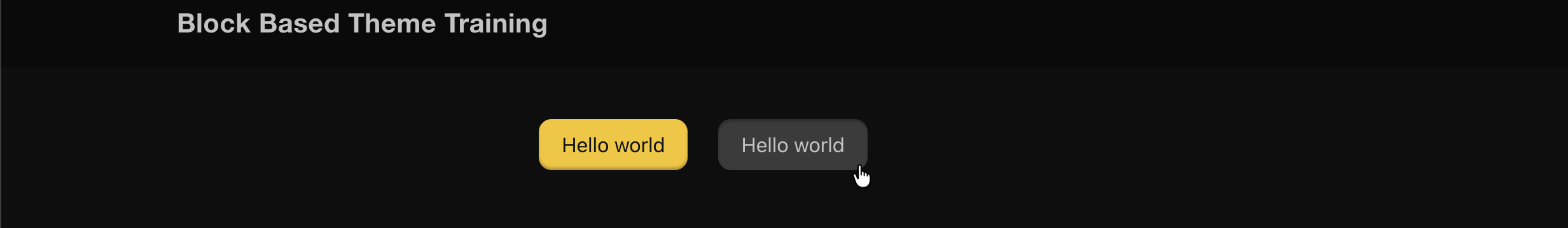
The only change from the previous version is "className":"is-clickable-card" on the outer Group block (and the matching is-clickable-card in the rendered class attribute). After rebuilding, hovering over a card on the frontend should reveal the title underline and the entire card surface should be clickable.
 Hovering over any part of the card should show the cursor as
 pointer and underline the title
Part B: Style variations
What are style variations?
Style variations are JSON files in the styles/ directory that give editors selectable design options in the block inspector's Styles panel. They use the theme.json schema and can target the full range of design tokens: colors, spacing, borders, shadows, and nested elements.
Explore an existing style variation
The scaffold already ships three "surface" style variations for the Group block in the styles/ directory. Open styles/surface-primary.json and notice it has an empty color object:
{
	"$schema": "https://schemas.wp.org/wp/6.7/theme.json",
	"version": 3,
	"title": "Primary",
	"slug": "primary",
	"blockTypes": [
		"core/group"
	],
	"styles": {
		"color": {}
	}
}
Update the color object to set a background and text color:
{
	"$schema": "https://schemas.wp.org/wp/6.7/theme.json",
	"version": 3,
	"title": "Primary",
	"slug": "primary",
	"blockTypes": [
		"core/group"
	],
	"styles": {
		"color": {
			"background": "var(--wp--preset--color--white)",
			"text": "var(--wp--preset--color--black)"
		}
	}
}
To see it in action, add a Group block in the editor with the "Primary" style applied:
<!-- wp:group {"className":"is-style-primary","layout":{"type":"constrained"}} -->
<div class="wp-block-group is-style-primary"><!-- wp:heading -->
<h2 class="wp-block-heading">Hello world</h2>
<!-- /wp:heading --></div>
<!-- /wp:group -->
You should see the Group get a white background with black text. You can also select the Group block and pick the "Primary" style from the Styles panel in the block inspector. Delete the test block when you're done.
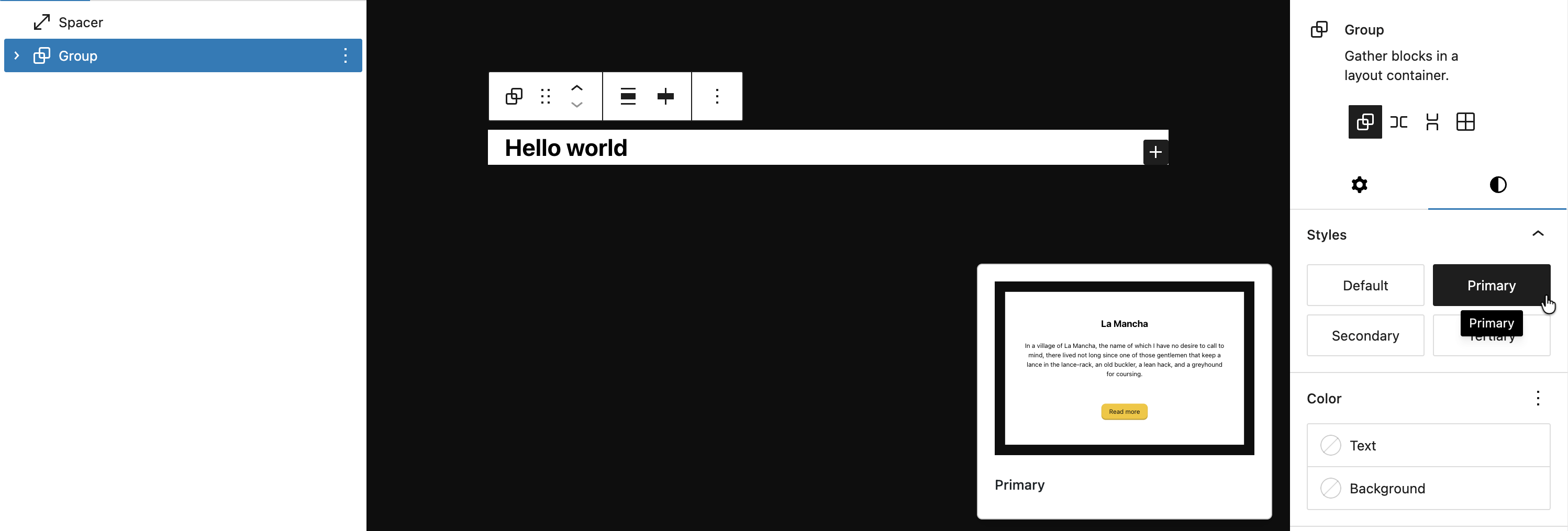 The Group block with our Primary style applied. Notice the Style preview also will display our changes
Hands-on: create style variations
Now that you've seen how a style variation works, we'll delete the scaffold surface variations and create a targeted one for the Button block.
-
Delete
styles/surface-primary.json,styles/surface-secondary.json, andstyles/surface-tertiary.json. -
Create
styles/button/secondary.json: transparent background, primary text, inset shadow:
Note that you can use directories here to group variations by block type or whatever convention you prefer. Slugs should be unique across files however.
{
    "$schema": "https://schemas.wp.org/wp/6.9/theme.json",
    "version": 3,
    "title": "Secondary",
    "slug": "secondary",
    "blockTypes": ["core/button"],
    "styles": {
        "color": {
            "background": "var(--wp--custom--color--background--light-transparent-10, rgba(163, 163, 163, 0.15))",
            "text": "var(--wp--custom--color--text--primary)"
        },
        "shadow": "0 1px 2px 0 rgba(255, 255, 255, 0.08) inset"
    }
}
Notice we only define the static styles (color, shadow) here. The hover and focus states are handled in CSS -- we'll explain why below.
- Add hover/focus styles in CSS. Add the following to
assets/css/components/button.css:
.is-style-secondary .wp-element-button {

    &:hover,
    &:focus {
        background-color: var(--wp--custom--color--background--light-transparent-20, rgba(163, 163, 163, 0.3));
        box-shadow: 0 2px 2px 0 rgba(0, 0, 0, 0.25) inset;
    }
}
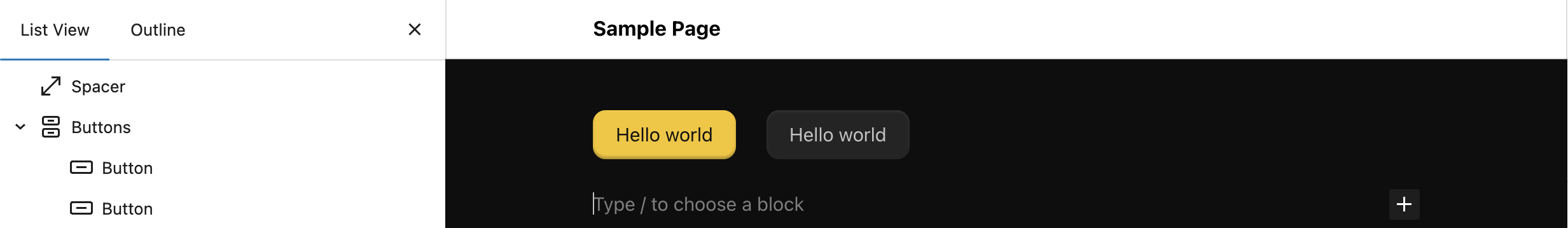
- Rebuild and verify: "Secondary" style appears for Button blocks in the editor and frontend.
Why hover/focus lives in CSS, not the variation JSON
You might wonder why we didn't put :hover and :focus in the variation JSON. Button style variations have a known specificity problem: the default button :hover/:focus styles from theme.json generate CSS with the same specificity as the variation's pseudo-state styles, and the defaults load last, so they always win. This is tracked in gutenberg#64856.
The fix is straightforward: keep static styles (color, shadow) in the variation JSON where they work reliably, and handle pseudo-states in CSS where you control specificity.
We're using a Button style variation here specifically to show you this limitation. In practice, you could just as easily register a block style (and arguably, should) with registerBlockStyle() in JS and lean entirely on CSS instead of writing json in the styles/ directory. Both approaches produce the same is-style-{slug} class on the block.
Style variations vs JS block styles
Both show up in the editor's Styles panel, but they work very differently:
| Feature | Style variations (JSON) | Block styles (JS) |
|---|---|---|
| Format | JSON file in styles/ | registerBlockStyle() in JS |
| What it does | Applies theme.json-style design tokens | Adds a CSS class name |
| Can target nested elements | Yes (elements.button, elements.link) | No |
| Can set spacing, borders, shadows | Yes | No, only via the added class in CSS |
| Registration | Automatic from file system | Manual via JS |
Files changed in this lesson
| File | Change type | What changes |
|---|---|---|
assets/css/base/html.css | New | a, button { transition: all 0.2s ease-in-out; } |
assets/css/base/layout.css | Modified | Added accent-color on html; added @view-transition { navigation: auto; } |
assets/css/base/index.css | Modified | Added @import url("html.css") |
assets/css/components/header.css | New | Sticky header with backdrop-filter, nav background, z-index, site-title font styling |
assets/css/components/card.css | New | Full-height groups, cursor utilities, clickable card hover styles via mixin |
assets/css/mixins/is-clickable-card.css | New | Encapsulates :has() hover selector excluding secondary interactive elements |
assets/js/is-clickable-card.js | New | JS-based clickable card utility, forwards clicks to primary heading link |
assets/css/components/button.css | New | .wp-element-button flex alignment with gap, pointer cursor; .is-style-secondary hover/focus states |
assets/css/components/index.css | Modified | Added imports: ./header.css, ./card.css, ./button.css |
assets/css/blocks/core/separator.css | New | Custom border-color using transparent token, 1px top border |
assets/css/blocks/core/post-featured-image.css | New | flex-shrink: 0; .is-style-single-movie-backdrop blurred backdrop effect |
assets/css/blocks/core/post-terms.css | New | Genre pill styling with transparent background, rounded borders |
assets/css/blocks/core/group.css | New | .has-separator dot pseudo-elements between children |
assets/css/utilities/layout.css | New | .flex-shrink-0 { flex-shrink: 0; } |
assets/css/utilities/visually-hidden.css | Modified | Added .is-hidden { display: none; } |
assets/css/utilities/index.css | Modified | Added @import url("layout.css") |
styles/surface-primary.json | Removed | Replaced by targeted per-block variations |
styles/surface-secondary.json | Removed | Replaced by targeted per-block variations |
styles/surface-tertiary.json | Removed | Replaced by targeted per-block variations |
styles/button/secondary.json | New | Secondary button: transparent bg, primary text, inset shadow |
Ship it checkpoint
- Sticky header with backdrop blur
- Card overlay links work (entire card is clickable)
- Separator CSS only loads on pages with separators (verify in DevTools)
- "Secondary" style appears for Button blocks in the editor
Takeaways
- Block-scoped CSS loads per-block via
assets/css/blocks/. Component CSS loads globally viafrontend.css. Choose intentionally. - WordPress inlines small stylesheets as critical CSS. Block-scoped CSS benefits from this automatically.
- Style variations are JSON files that give editors controlled styling choices. They support the full
theme.jsonstyles schema. - Button variations need to target
elements.button, not the wrapper. - Clickable cards use JS-based progressive enhancement for accessibility. The heading link is the primary link (good screen reader context), and the entire card surface is clickable.
Further reading
- Anatomy of a block based theme (section on writing CSS for individual blocks)
- Styles Reference
- Block Styles